Note
Download this example as a Jupyter notebook here: https://github.com/pypsa/atlite/examples/plotting_with_atlite.ipynb
Plotting with Atlite
This little notebook creates all the plots given in the introduction section. Geographical plotting with Atlite can be efficiently and straightfowardly done when relying on some well maintained python packages. In particular a good rule of thumb is following. When it comes to
projections and transformation → ask Cartopy
plotting shapes → ask GeoPandas
plotting data on geographical grids or time series → ask xarray
Since they interact well together, one has just to consider some essential commands. So, let’s dive into the code!
First of all import all relevant packages
[1]:
import os
import matplotlib.pyplot as plt
from matplotlib.gridspec import GridSpec
import seaborn as sns
import geopandas as gpd
import pandas as pd
from pandas.plotting import register_matplotlib_converters
register_matplotlib_converters()

import cartopy.crs as ccrs
from cartopy.crs import PlateCarree as plate
import cartopy.io.shapereader as shpreader

import xarray as xr
import atlite

import logging
import warnings

warnings.simplefilter('ignore')
logging.captureWarnings(False)
logging.basicConfig(level=logging.INFO)
Note: ``geopandas`` will also require the ``descartes`` package to be installed.
Create shapes for United Kingdom and Ireland
use the shapereader of Cartopy to retrieve high resoluted shapes
make a GeoSeries with the shapes
[2]:
shpfilename = shpreader.natural_earth(resolution='10m',
                                      category='cultural',
                                      name='admin_0_countries')
reader = shpreader.Reader(shpfilename)
UkIr = gpd.GeoSeries({r.attributes['NAME_EN']: r.geometry
                      for r in reader.records()},
                     crs={'init': 'epsg:4326'}
                     ).reindex(['United Kingdom', 'Ireland'])
Create the cutout
create a cutout with geographical bounds of the shapes
Here we use the data from ERA5 from UK and Ireland in January of 2011.
[3]:
# Define the cutout; this will not yet trigger any major operations
cutout = atlite.Cutout(path="uk-2011-01",
                       module="era5",
                       bounds=UkIr.unary_union.bounds,
                       time="2011-01")

# This is where all the work happens (this can take some time, for us it took ~15 minutes).
cutout.prepare()
INFO:atlite.data:Cutout already prepared.
[3]:
<Cutout "uk-2011-01">
 x = -13.50 ⟷ 1.75, dx = 0.25
 y = 50.00 ⟷ 60.75, dy = 0.25
 time = 2011-01-01 ⟷ 2011-01-31, dt = H
 module = era5
 prepared_features = ['height', 'wind', 'influx', 'temperature', 'runoff']
Define a overall projection
This projection will be used throughout the following plots. It has to be assigned to every axis that should be based on this projection
[4]:
projection = ccrs.Orthographic(-10, 35)
Plotting
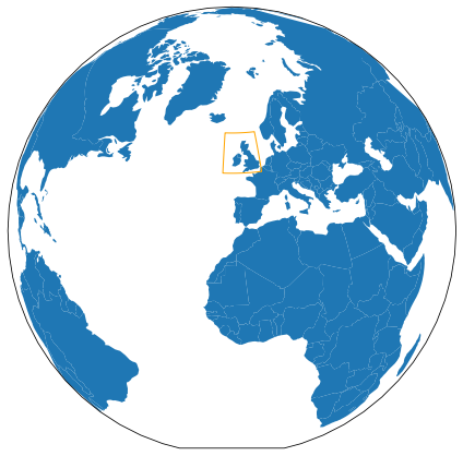
Plot Earth with cutout bound
create GeoSeries with cell relevant data
plot ‘naturalearth_lowres’ (country shapes) with unary union of cells on top
[5]:
cells = cutout.grid
df = gpd.read_file(gpd.datasets.get_path('naturalearth_lowres'))
country_bound = gpd.GeoSeries(cells.unary_union)

projection = ccrs.Orthographic(-10, 35)
fig, ax = plt.subplots(subplot_kw={'projection': projection}, figsize=(6, 6))
df.plot(ax=ax, transform=plate())
country_bound.plot(ax=ax, edgecolor='orange',
                   facecolor='None', transform=plate())
fig.tight_layout()
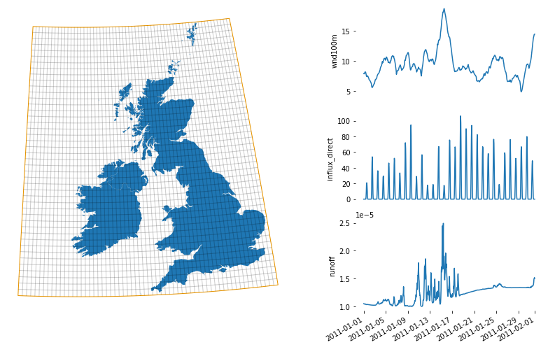
Plot the cutout’s raw data
create matplotlib GridSpec
country shapes and cells on left hand side
time series for
wind100m,influx_direct,runoffon right hand side
[6]:
fig = plt.figure(figsize=(12, 7))
gs = GridSpec(3, 3, figure=fig)

ax = fig.add_subplot(gs[:, 0:2], projection=projection)
plot_grid_dict = dict(alpha=0.1, edgecolor='k', zorder=4, aspect='equal',
                      facecolor='None', transform=plate())
UkIr.plot(ax=ax, zorder=1, transform=plate())
cells.plot(ax=ax, **plot_grid_dict)
country_bound.plot(ax=ax, edgecolor='orange',
                   facecolor='None', transform=plate())
ax.outline_patch.set_edgecolor('white')

ax1 = fig.add_subplot(gs[0, 2])
cutout.data.wnd100m.mean(['x', 'y']).plot(ax=ax1)
ax1.set_frame_on(False)
ax1.xaxis.set_visible(False)

ax2 = fig.add_subplot(gs[1, 2], sharex=ax1)
cutout.data.influx_direct.mean(['x', 'y']).plot(ax=ax2)
ax2.set_frame_on(False)
ax2.xaxis.set_visible(False)

ax3 = fig.add_subplot(gs[2, 2], sharex=ax1)
cutout.data.runoff.mean(['x', 'y']).plot(ax=ax3)
ax3.set_frame_on(False)
ax3.set_xlabel(None)
fig.tight_layout()
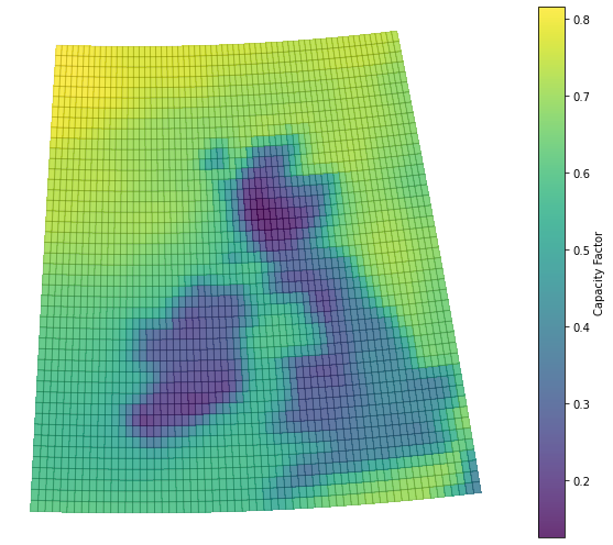
Plot capacity factors
calculate the mean capacity factors for each cell for a selected turbine (e.g. Vestas V112 3MW)
use xarray plotting function to directly plot data
plot cells GeoSeries on top
[7]:
cap_factors = cutout.wind(turbine='Vestas_V112_3MW', capacity_factor=True)

fig, ax = plt.subplots(subplot_kw={'projection': projection}, figsize=(9, 7))
cap_factors.name = 'Capacity Factor'
cap_factors.plot(ax=ax, transform=plate(), alpha=0.8)
cells.plot(ax=ax, **plot_grid_dict)
ax.outline_patch.set_edgecolor('white')
fig.tight_layout();
INFO:atlite.convert:Convert and aggregate 'wind'.
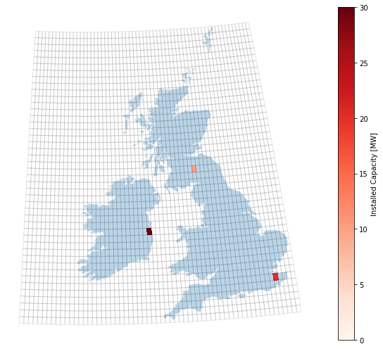
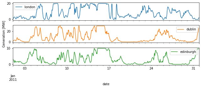
Plot power generation for selected areas
First define a capacity layout, defining on which sites to install how much turbine capacity
Generate the power generation time series for the selected sites
[8]:
sites = gpd.GeoDataFrame([['london', 0.7, 51.3, 20],
                          ['dublin', -6.16, 53.21, 30],
                          ['edinburgh', -3.13, 55.5, 10]],
                         columns=['name', 'x', 'y', 'capacity']
                         ).set_index('name')

nearest = cutout.data.sel(
    {'x': sites.x.values, 'y': sites.y.values}, 'nearest').coords
sites['x'] = nearest.get('x').values
sites['y'] = nearest.get('y').values
cells_generation = sites.merge(
    cells, how='inner').rename(pd.Series(sites.index))

layout = xr.DataArray(cells_generation.set_index(['y', 'x']).capacity.unstack())\
                    .reindex_like(cap_factors).rename('Installed Capacity [MW]')

fig, ax = plt.subplots(subplot_kw={'projection': projection}, figsize=(9, 7))

UkIr.plot(ax=ax, zorder=1, transform=plate(), alpha=0.3)
cells.plot(ax=ax, **plot_grid_dict)
layout.plot(ax=ax, transform=plate(), cmap='Reds', vmin=0,
            label='Installed Capacity [MW]')
ax.outline_patch.set_edgecolor('white')
fig.tight_layout()

fig, axes = plt.subplots(len(sites), sharex=True, figsize=(9, 4))
power_generation = cutout.wind('Vestas_V112_3MW', layout=layout,
                               shapes=cells_generation.geometry)

power_generation.to_pandas().plot(subplots=True, ax=axes)
axes[2].set_xlabel('date')
axes[1].set_ylabel('Generation [MW]')
fig.tight_layout()
INFO:atlite.convert:Convert and aggregate 'wind'.
INFO:numexpr.utils:NumExpr defaulting to 8 threads.
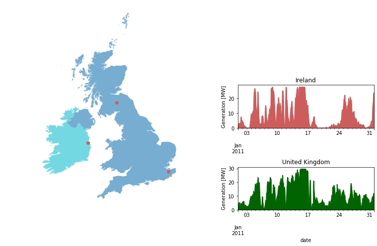
Aggregate power generation per country shape
[9]:
from shapely.geometry import Point

fig = plt.figure(figsize=(12, 7))
gs = GridSpec(3, 3, figure=fig)

ax = fig.add_subplot(gs[:, 0:2], projection=projection)
df = gpd.GeoDataFrame(UkIr, columns=['geometry']).assign(color=['1', '2'])
df.plot(column='color', ax=ax, zorder=1, transform=plate(), alpha=0.6)

sites.assign(geometry=sites.apply(lambda ds: Point(ds.x, ds.y), axis=1)
             ).plot(ax=ax, zorder=2, transform=plate(), color='indianred')

ax.outline_patch.set_edgecolor('white')

power_generation = cutout.wind('Vestas_V112_3MW', layout=layout.fillna(0), shapes=UkIr
                               ).to_pandas().rename_axis(index='', columns='shapes')

ax1 = fig.add_subplot(gs[1, 2])
power_generation['Ireland'].plot.area(
    ax=ax1, title='Ireland', color='indianred')
ax2 = fig.add_subplot(gs[2, 2])
power_generation['United Kingdom'].plot.area(
    ax=ax2, title='United Kingdom', color='darkgreen')

ax2.set_xlabel('date')
[ax.set_ylabel('Generation [MW]') for ax in [ax1,ax2]]

fig.tight_layout()
INFO:atlite.convert:Convert and aggregate 'wind'.
Plot indicator matrix
use seaborn heatmap for plotting the indicator matrix of the United Kingdom shape
This indicator matrix is used to tell Atlite, which cells in the cutout represent the land area of the UK.
[10]:
fig, ax = plt.subplots(figsize=(7, 7))
indicator_matrix_ir = cutout.indicatormatrix(UkIr)[0]

indicator_matrix_ir = xr.DataArray(indicator_matrix_ir.toarray().reshape(cutout.shape),
                                   dims=['lat','lon'],
                                   coords=[cutout.coords['lat'], cutout.coords['lon']])
indicator_matrix_ir.plot(cmap="Greens", ax=ax)
[10]:
<matplotlib.collections.QuadMesh at 0x7f07b06ab490>
